We take a look at summarizing samples with histograms and kernel density estimators.
Author
Paweł Czyż
Published
August 1, 2023
I have recently seen Michael Betancourt’s talk in which he explains why kernel density estimators can be misleading when visualising samples and points to his wonderful case study which includes comparison between histograms and kernel density estimators, as well as many other things.
I recommend reading this case study in depth; in this blog post we will only try to reproduce the example with kernel density estimators in Python.
Problem setup
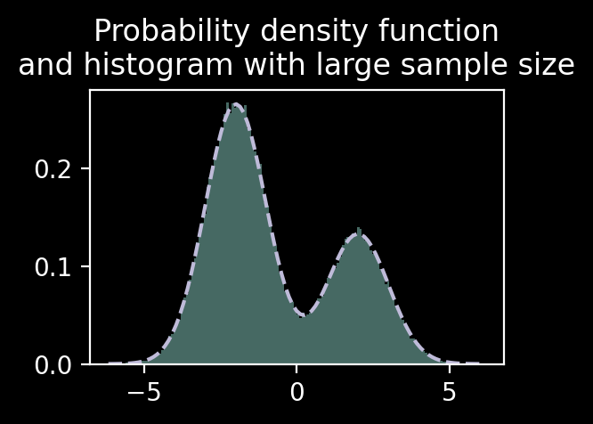
We will start with a Gaussian mixture with two components and draw the exact probability density function (PDF) as well as a histogram with a very large sample size.
Code
import matplotlib.pyplot as pltimport numpy as np from scipy import statsplt.style.use("dark_background")class GaussianMixture:def__init__(self, proportions, mus, sigmas) ->None: proportions = np.asarray(proportions)self.proportions = proportions / proportions.sum()assert np.min(self.proportions) >0self.mus = np.asarray(mus)self.sigmas = np.asarray(sigmas) n =len(self.proportions)self.n_classes = nassertself.proportions.shape == (n,)assertself.mus.shape == (n,)assertself.sigmas.shape == (n,)def sample(self, rng, n: int) -> np.ndarray: z = rng.choice(self.n_classes, p=self.proportions, replace=True, size=n, )returnself.mus[z] +self.sigmas[z] * rng.normal(size=n)def pdf(self, x): ret =0for k inrange(self.n_classes): ret +=self.proportions[k] * stats.norm.pdf(x, loc=self.mus[k], scale=self.sigmas[k])return retmixture = GaussianMixture( proportions=[2, 1], mus=[-2, 2], sigmas=[1, 1],)rng = np.random.default_rng(32)large_data = mixture.sample(rng, 100_000)x_axis = np.linspace(np.min(large_data), np.max(large_data), 101)pdf_values = mixture.pdf(x_axis)fig, ax = plt.subplots(figsize=(3, 2), dpi=100)ax.hist(large_data, bins=150, density=True, histtype="stepfilled", alpha=0.5, color="C0")ax.plot(x_axis, pdf_values, c="C2", linestyle="--")ax.set_title("Probability density function\nand histogram with large sample size")
Text(0.5, 1.0, 'Probability density function\nand histogram with large sample size')
Great, histogram with large sample size agreed well with the exact PDF!
Plain old histograms
Let’s now move to a more challenging problem: we have only a moderate sample size available, say 100 points.
We see that too few bins (three, but nobody will actually choose this number for 100 data points) we don’t see two modes and that for more than 20 and 50 bins the histogram looks quite noisy. Both 5 and 10 bins would make a sensible choice in this problem.
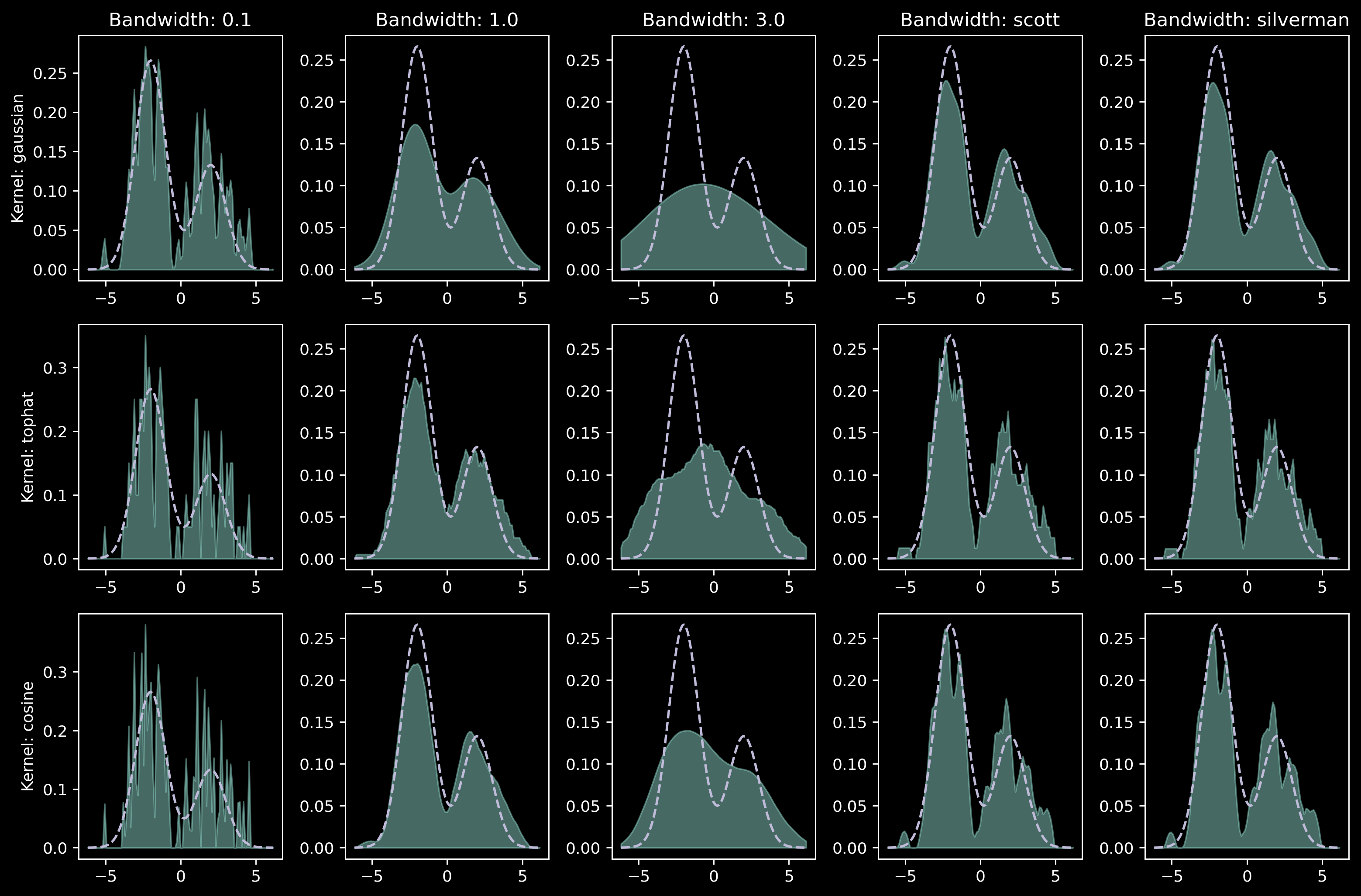
Kernel density estimators
Now it’s the time for kernel density estimators. We will use several kernel families and several different bandwidths:
I see the point now! Apart from the small bandwidth case (0.1 and sometimes Silverman) the issues with KDE plots are hard to diagnose. Moreover, conclusions from different plots are different: is the distribution multimodal? If so, how many modes are there? What are the “probability masses” of each modes? Observing only one of these plots can lead to wrong conclusions.