A quick look at the differences between mixture and admixture models.
Author
Paweł Czyż
Published
April 14, 2024
Consider a binary genome vector \(Y_{n\bullet} = (Y_{n1}, \dotsc, Y_{nG})\) representing at which loci a mutation has appeared. One of the simplest models is to assume that mutations appear independently, with \(\theta_g = P(Y_{ng} = 1)\) representing the probability of mutation occurring. In other words, \[\begin{align*}
P(Y_{n\bullet} = y_{n\bullet} \mid \theta_\bullet) &= \prod_{g=1}^G P(Y_{ng}=y_{ng} \mid \theta_g ) \\
&= \prod_{g=1}^G \theta_g^{Y_{ng}}(1-\theta_g)^{1-Y_{ng}}.
\end{align*}
\]
Consider the case where we observe \(N\) exchangeable genomes. We will assume that they are conditionally independent given the model parameters: \[
P(Y_{*\bullet} = y_{*\bullet}\mid \theta_\bullet) = \prod_{n=1}^N P(Y_{n\bullet}=y_{n\bullet}\mid \theta_\bullet).
\]
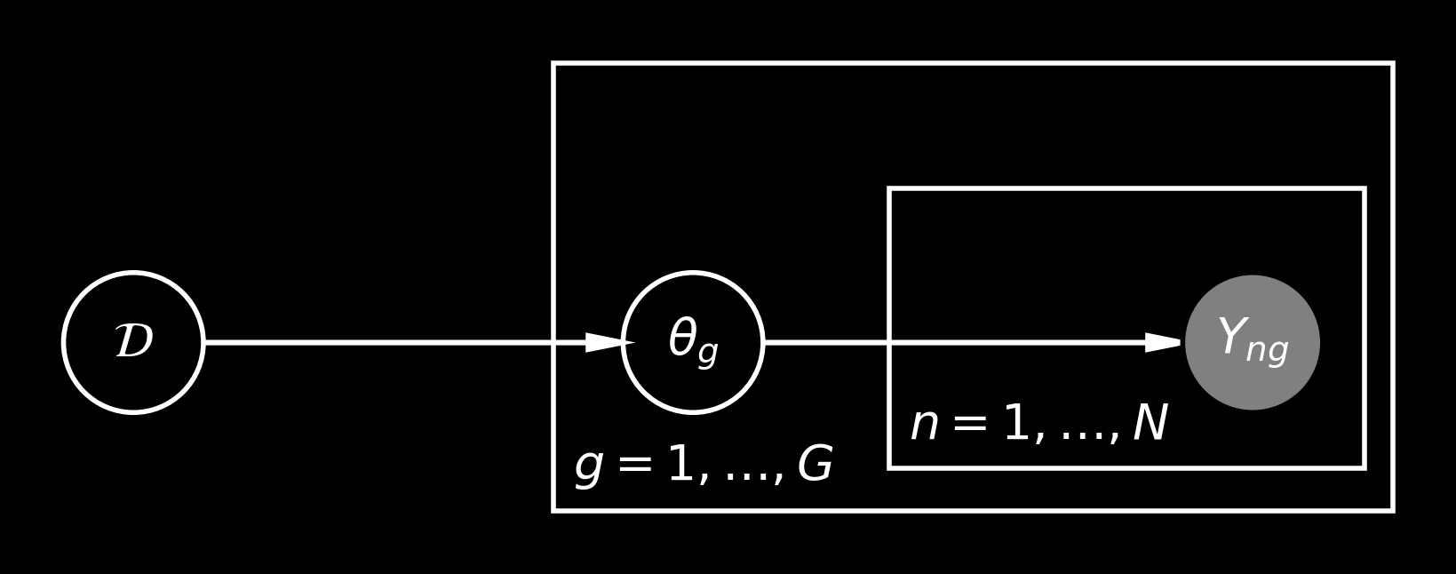
There’s an obligatory probabilistic graphical model representing our assumptions:
where \(\mathcal D\) is the prior over the \(\theta_\bullet\) vector, i.e., \(\theta_g \mid \mathcal D \sim \mathcal D\) and \(\mathcal D\) is supported on the interval \((0, 1)\). The simplest choice is to fix \(\mathcal D = \mathrm{Uniform}(0, 1)\), but this may be not flexible enough. Namely, different draws from the posterior on \(\theta\) may look quite different than draws from \(\mathcal D\). And this discrepancy would be easy to observe once \(G\) is large.
Hence, the simplest improvement to this model is to make \(\mathcal D\) more flexible, i.e., treating it as a random probability measure with some prior on it. The simplest possibility is to use \(\mathcal D = \mathrm{Beta}(\alpha, \beta)\), where \(\alpha\) and \(\beta\) are given some gamma (say) priors, but more flexible models are possible (such as mixtures of beta distribution or a Dirichlet process).
This model has enough flexibility to model marginal the mutation occurrence probabilities \(P(Y_{n g} = 1)\): given enough samples \(N\), the posterior on \(\theta_g\) should concentrate around the average \(N^{-1}\sum_{n=1}^N Y_{ng}\) (and, provided that \(\mathcal D\) is flexible enough, it may concentrate near the distribution of these averages).
Great: this model is flexible enough to describe well the mutation probabilities. However, it’s quite rigid when it comes to mutation exclusivity and cooccurrence: \[
P(Y_{n1}=1, Y_{n2} = 1) = P(Y_{n1} = 1) \cdot P(Y_{n2} = 1) = \theta_{1}\theta_{2}.
\]
We generally expect that mutations in some genes could lead to synthetic lethality, so they would be exclusive. Also, the genes are ordered in chromosomes and copy number aberrations can lead to mutations being simultaneously observed in several genes (e.g., if they are in the fragment of the chromosome which is frequently lost).
The discrepancies between this “independent mutations” model and real data is generally easy to observe by plotting the correlation matrix between different genes. I also like looking at the the empirical distribution of the observed number of mutations in one sample, i.e., \(\sum_{g=1}^G Y_{ng}\), as the model predictis a Poisson binomial distribution, while real data may show very different behaviour.
Mixture models
The model above is not flexible enough to model co-occurrences and exclusivity between different mutations.
Imagine that we sequence \(G=3\) genes which lie very close together.
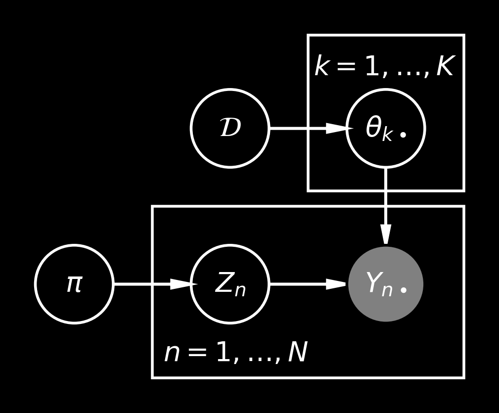
If there is no large deletion in this chromosome, they are independently mutated with probabilities \(1\%\), \(5\%\) and \(10\%\), respectively. However, if there is a large deletion, we will notice that they are all gone. Hence, it would make sense to consider two different “populations” with mutation probabilities \(\theta_{1\bullet} = (1\%, 5\%, 10\%)\) and \(\theta_{2\bullet} = (100\%, 100\%, 100\%)\), where the “population” describes whether such a large deletion had place. More generally, if we consider \(K\) “populations”, we can introduce sample-specific variables \(Z_n \in \{1, 2, \dotsc, K\}\) and the distributions \[
P(Y_{n\bullet} \mid Z_n, \{\theta_{k\bullet}\}_{k=1, \dotsc, K}) = P(Y_{n\bullet} \mid \theta_{Z_n\bullet}).
\]
where \(\pi\in \Delta^{K-1}\) is proportion vector over \(K\) “populations”.
Due to the conditional independence structure in this model, we can also integrate out the \(Z_n\) variables to get \[
P(Y_n \mid \{\theta_{k\bullet}\}_{k=1, \dotsc, K}, \pi) = \sum_{k=1}^K \pi_k \, P(Y_{n\bullet} \mid \theta_{k\bullet} )
\]
This integrated out representation is quite convenient for inference (see Stan User’s guide).
How expressive are finite mixtures?
In principle, the mixtures can be used to model an arbitrary distribution over binary vectors: consider \(K=2^G\) and each \(\theta_{k\bullet}\) vector to represent a different string \(0\) and \(1\) digits. Hence, we see that the “populations” do not necessarily have biological meaning. (See also Chapter 22 of Bayesian Data Analysis or this Cosma Shalizi’s blog post explaining the overinterpretation issues in factor analysis).
Another issue with using \(K=2^G\) classes is that \(2^G\) is usually much larger than \(N\), so that finding a suitable set of parameters \(\{\theta_{k\bullet}\}\) may be tricky. We will generally prefer a smaller number of components, although using a Dirichlet process mixture model is possible (which is quite funny, because in these models \(K=\infty\) and there may be more occupied components than \(2^G\), which still result in the distribution which could be modelled with \(2^G\) clusters).
The mixtures (with a smaller number of components than \(2^G\)) are generally very popular, even if it is not always immediately clear that a model is a finite mixture: for example, this model can be modelled as a mixture with \(K = G+1\) components for an appropriate prior constraining the \(\theta\) parameters.
Another example of such model are Bayesian pyramids: imagine that we sequence genes 1, 2, 3 on one chromosome and genes 4, 5, 6 on another chromosome, then we may consider the following idealised model employing \(K=4\) “populations”:
\(Z_n=1\) means that neither chromosome is lost. Mutations in the genes arise independently.
\(Z_n=2\) means that only the first chromosome is lost, i.e., genes 1, 2, 3 are mutated. The mutations at loci 4, 5, 6 can arise independently.
\(Z_n=3\) means that the second chromosome is lost, i.e., genes 4, 5, 6 are mutated. The mutations at loci 1, 2, 3 can arise independently.
\(Z_n=4\) means that both chromosomes are lost and we observe mutations in all six genes.
This model with four populations works. However, some of the parameters are tied together, as they correspond to the effects of deletion of two different chromosomes and using this structure may be important for the scalability and speed of posterior shrinkage: if we consider 10 different chromosomes, we don’t need to model \(2^10\) independent clusters. More on this parameter constraints is in Section 3.1 of the original paper. (And, if you are interested in the biological applications to tumor genotypes, I’ll be showing a poster at RECOMB 2024 on this topic! You can also take a look at the Jnotype package).
Admixture models
Above we discussed that mixture models can be very expressive when they have many components (so sometimes the parameters are shared between different components).
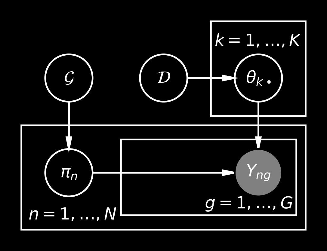
Let’s think about an admixture model, which can be treated as a simplified version of the STRUCTURE model. We again assume that we have some probability vectors \(\theta_{k\bullet}\) for \(k=1, \dotsc, K\). However, in this case we will call them “topics” or distinct mutational mechanisms which operate in the following way. For each gene \(Y_{ng}\) there is a mechanism \(T_{ng} \in \{1, \dotsc, K\}\) which is used to generate the mutation: \[
P(Y_{ng} =1 \mid T_{ng}, \{\theta_{k\bullet}\}_{k=1, \dotsc, K}) = \theta_{T_{ng}g}.
\]
The mechanisms corresponding to different genes are drawn independently within each sample, i.e., we have a sample-specific proportion vector \(\pi_n\in \Delta^{K-1}\) which is used to sample the topics: \[
T_{ng} \mid \pi_n \sim \mathrm{Categorical}(\pi_n).
\]
Similarly as in the mixture models, we can integrate out the latent variables: \[\begin{align*}
P(Y_{n\bullet} \mid \pi_n, \{\theta_{k\bullet}\}_{k=1, \dotsc, K}) &= \sum_{T_{n\bullet}} P(Y_{n\bullet} \mid T_{n\bullet}, \{\theta_{k\bullet}\}_{k=1, \dotsc, K}) P(T_{n\bullet} \mid \pi_n ) \\
&= \sum_{T_{n\bullet}} \prod_{g=1}^G P( Y_{ng} \mid \theta_{T_{ng}g}) P(T_{ng} \mid \pi_n) \\
&= \prod_{g=1}^G \left( \sum_{k=1}^K P(Y_{ng}\mid \theta_{kg})\, \pi_{nk} \right)
\end{align*}
\]
We see that if the proportions vector \(\pi_n\) becomes one-hot vectors, then the admixture model reduces to the mixture model we have seen above. However, this model is more flexible.
Let’s draw the version with local variables integrated out:
The issue in this model is that we have \(O(KG)\) parameters in the \(\theta\) matrix (unless some parameter sharing is used) and additionally we have \(O(NK)\) parameters of the proportion vectors. Hence, the inference in this model may be trickier to apply.
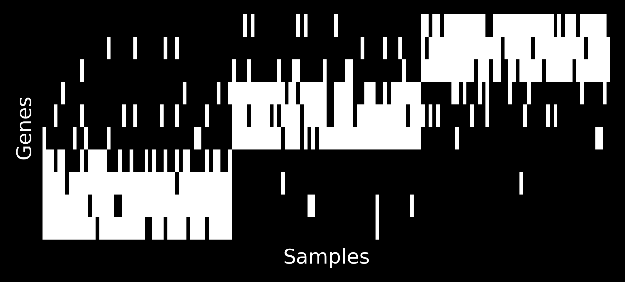
How do the samples look like?
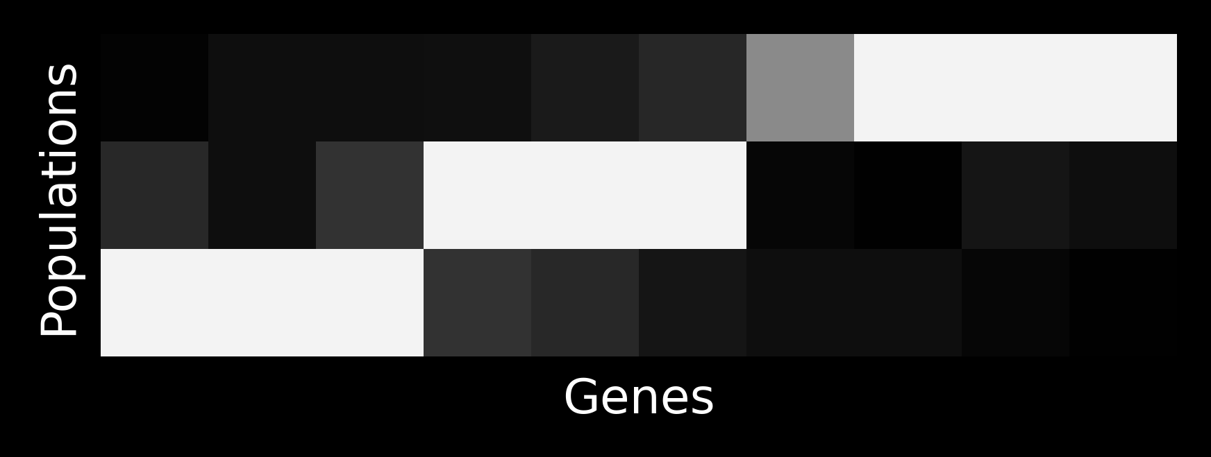
Let’s take \(G=10\) and \(K=3\) and simulate some \(\theta\) matrix:
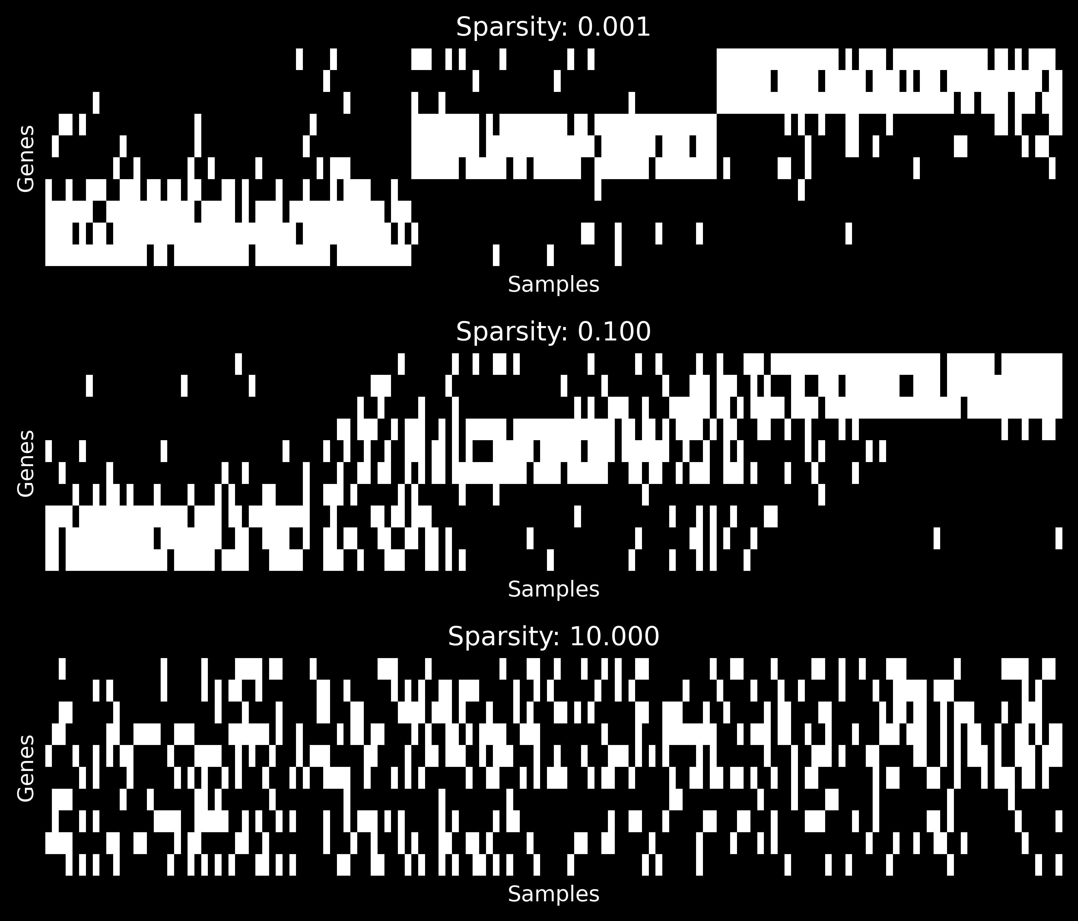
On the other hand, if we sample from an admixture model, where \(\pi_n \sim \mathrm{Dirichlet}(\alpha, \alpha, \alpha)\) for different values of \(\alpha\), we will get the following proportion vectors:
Code
N =150alphas = [0.001, 0.1, 10.0]fig, axs = plt.subplots(3, 1, figsize=(7, 6), dpi=250, sharex=True, sharey=True)pis = np.zeros((len(alphas), N, K))for i, (alpha, ax) inenumerate(zip(alphas, axs)): pi = rng.dirichlet(alpha * np.ones(K), size=N) index = np.argsort( np.einsum("nk,k->n", pi, np.arange(K))) pi = pi[index, :] pis[i, ...] = pi x_axis = np.arange(0.5, N +0.5) prev =0.0for k inrange(K): ax.fill_between(x_axis, prev, prev + pi[:, k], color=f"C{k+4}") prev = prev + pi[:, k] ax.spines[["top", "right"]].set_visible(False) ax.set_xlabel("Samples") ax.set_ylabel("Proportions") ax.set_xticks([]) ax.set_title(f"$\\alpha$: {alpha:.3f}")fig.tight_layout()plt.show()
Note that for \(\alpha \approx 0\) the proportion vectors are close to one-hot, so that the admixture reduces to the mixture above.
We can generate the following samples corresponding to proportion vectors above as following:
There is an excellent introduction to mixture and admixture models in Jeff Miller’s Bayesian methodology in biostatistics course (see lectures 9–12).
Nicola Roberts used hierarchical Dirichlet processes (which are also an admixture model, although of a bit different kind) to study mutational patterns during her PhD.
Barbara Engelhardt and Matthew Stephens wrote a nice paper interpreting admixture models as matrix factorizations. Of course, mixture models (being a special case of an admixture) also fit in this framework.
Quantification is naturally related to admixture models. We discussed it here and there.